I found my image here http://www.nysportsjournalism.com/twix-campaign-goes-left-right/. It was created by Twix for their right or left campaign.
Here is the original
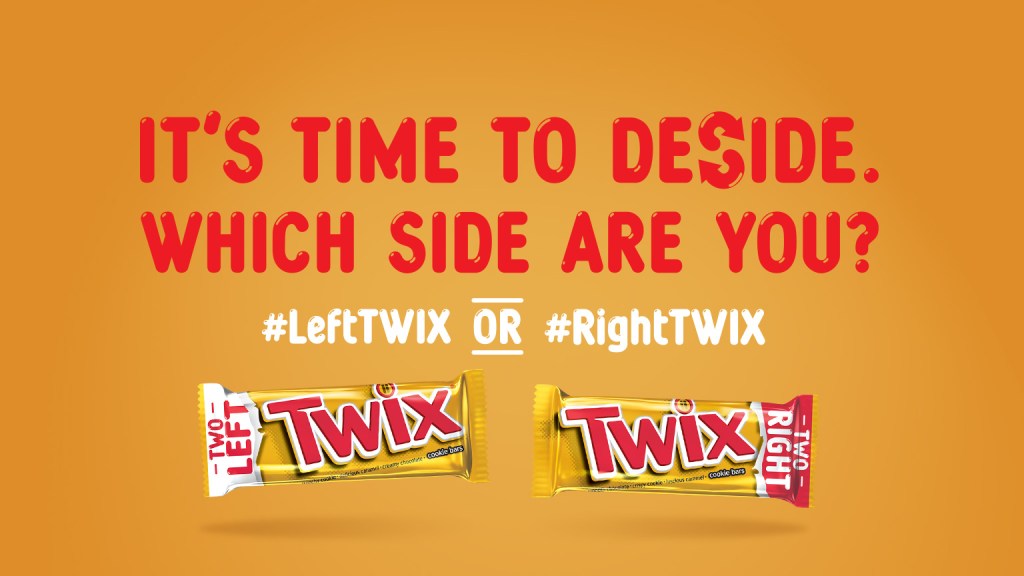
Contrast – The text is a very different color and pops off the screen
Repetition – The use of the ‘hashtag’ and font help cement the two sides being related
Alignment – The “It’s time to…are you?” text is aligned on each end and makes good use of being center aligned.
Proximity – The Twix bars being at the bottom is a good example of items being similar being grouped together
Color – The background color matches the color of the wrapper with just enough difference so they still have a little contrast. They also match the red text color with the wrapper text and the white text with the white on the wrapper.
The principles contribute to the design by making the ad easy to read and get the point across. I really like their choice of the background color matching the packaging as well as the font colors matching. It makes the whole ad feel like a Twix package. I was also impressed that the top text was perfectly aligned on both the left and right, it really helped bring the focus to the words.
