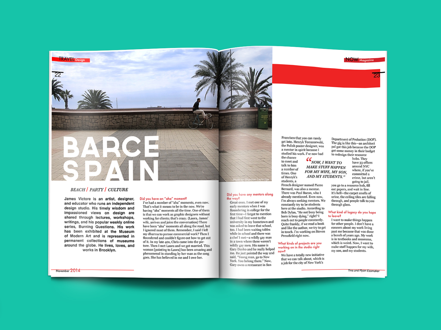
Introduction I found the image at https://stloch.com/barcelona-magazine-spread . I think the designers are Tina and Ryan Essmaker from NOW Magazine. It was published in November 2014. Analysis Rule of Thirds The photographer is following the rule of thirds by placing the object on the right hand side of the photo. The page designer also addedContinue reading “Subtle Design in Magazines”
Tag Archives: Design
The Beauty of a Twix Ad
I found my image here http://www.nysportsjournalism.com/twix-campaign-goes-left-right/. It was created by Twix for their right or left campaign. Here is the original Contrast – The text is a very different color and pops off the screen Repetition – The use of the ‘hashtag’ and font help cement the two sides being related Alignment – The “It’sContinue reading “The Beauty of a Twix Ad”
