
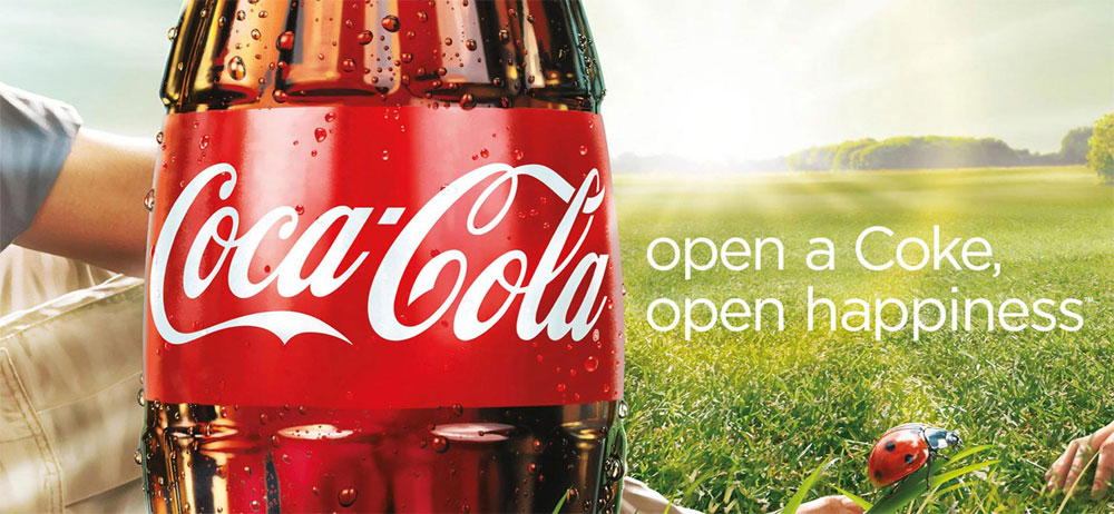
This image was found at https://www.designyourway.net/drb/wp-content/uploads/2012/11/Coca-Cola-open-happiness1.j.jpg It was created as a collaboration between Ogilvy New York, Sra Rushmore and Santo for Coca-Cola.
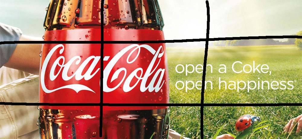
I really liked how everything was aligned. “open happiness” is along the same line as Coca-Cola. and Coca-cola is centered horizontally. I also like the lady bug that is added to the right side to help break up the dead space on that side of the frame.
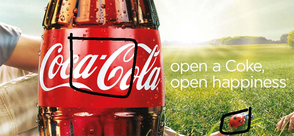
I like the use of reds and green in this ad. They work well together and help make the bottle of coke pop. Its also nice that the red on the ladybug matches the red of the label.
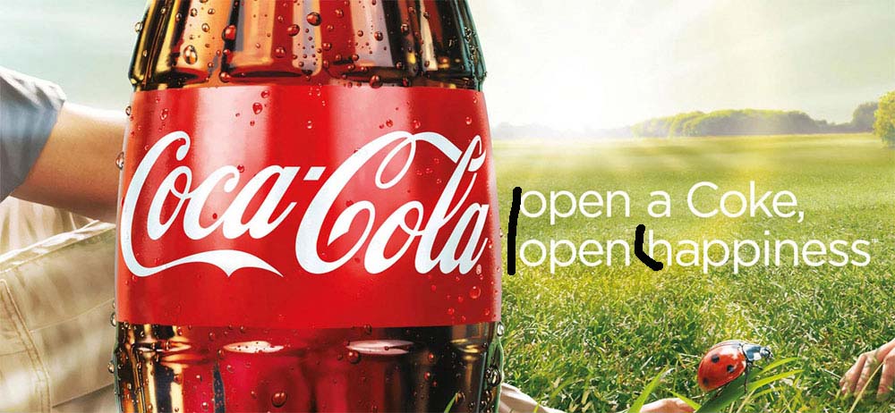
I like the choice only have Coke capitalized and the rest of the words lowercase. It helps Coke stand out. I also like the font they picked, its very crisp and sharp.
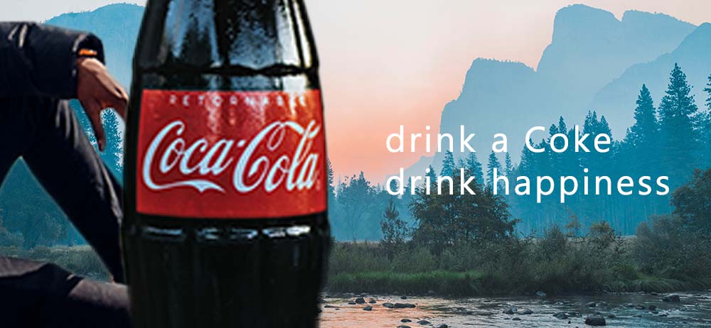
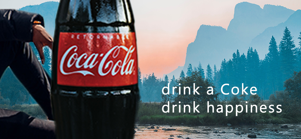
To keep the theme from the first one. I also kept everything centered horizontally. I lined up the bottom line with the bottom of Coca-Cola
I went with a cooler tone in my AD. Darker coke, darker pants. Blue jacket, blue treetops and mountains.
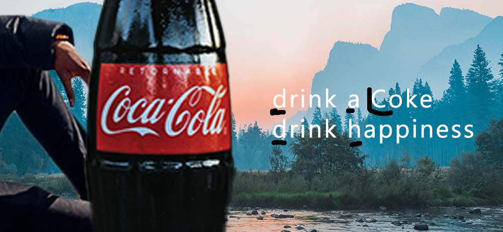
I choose to follow the same font guidlines as the other ad and just capitalized Coke and choose a sharp crisp font.
These ads work together because they both show that regardless of where you are coke will always make you happier. You can be in the mountains or in a field and a Coke will only make it better.
